View
Real - Sports Mobile App
Reimagined the onboarding experience top simplify discovery and help users feel guided, connected, and excited at every step.
Real is a fast-growing social sports app that blends live sports data, collectible player cards, and live community engagement. Despite its depth, many users struggled to discover or fully understand its core features.
I led the redesign of key parts of the experience, focused on improving onboarding and helping new users engage with the app’s most valuable features from the very start, while improving the experience for active users as well.

The Problem
Since launching in 2021, the Real - Sports app has grown to 1.8 million members, with 505,000 daily active users. Real has a clear mission: to make sports data accessible, social, and fun — and despite being able to do that through it’s unique features, new users often struggled to understand the app’s value out of the gate.
First-time users were thrown into the app with no guided onboarding experience, and with key features like collecting player cards and rax (Real’s in-app currency) hidden behind cluttered navigation, both new and returning users found it difficult to fully engage.
These problems could disrupt long-term growth potential and retainment rate, especially since some of their exciting features offer in-app purchases.
Research & Insight
Before diving into the redesign, I explored user reviews to better understand how Real’s current experience was landing with its audience. I began to see patterns in how users were experiencing confusion navigating the interface and struggles finding the app's features. These patterns were clear to see once I began the initial audit of the app’s screens.


Before the redesign, Real had no structured onboarding experience. There was no introduction to key features and no context around core mechanics like Rax, Karma, or card collecting. This absence of direction meant that users were expected to figure things out on their own, leading to confusion around everything outside of the features relating to live sports.
Solution
In a product as feature-rich as Real, utility alone isn’t enough. Users need to feel oriented, motivated, and connected to the experience from the start. The goal was to help users feel like they belong in the experience instead of spending time attempting to figure it out. Every interaction was designed to build familiarity, reduce cognitive load, and reinforce what makes Real exciting, rewarding, and worth returning to.

The previous sign-up flow included cold screens that were solely used to capture and verify the user's information.
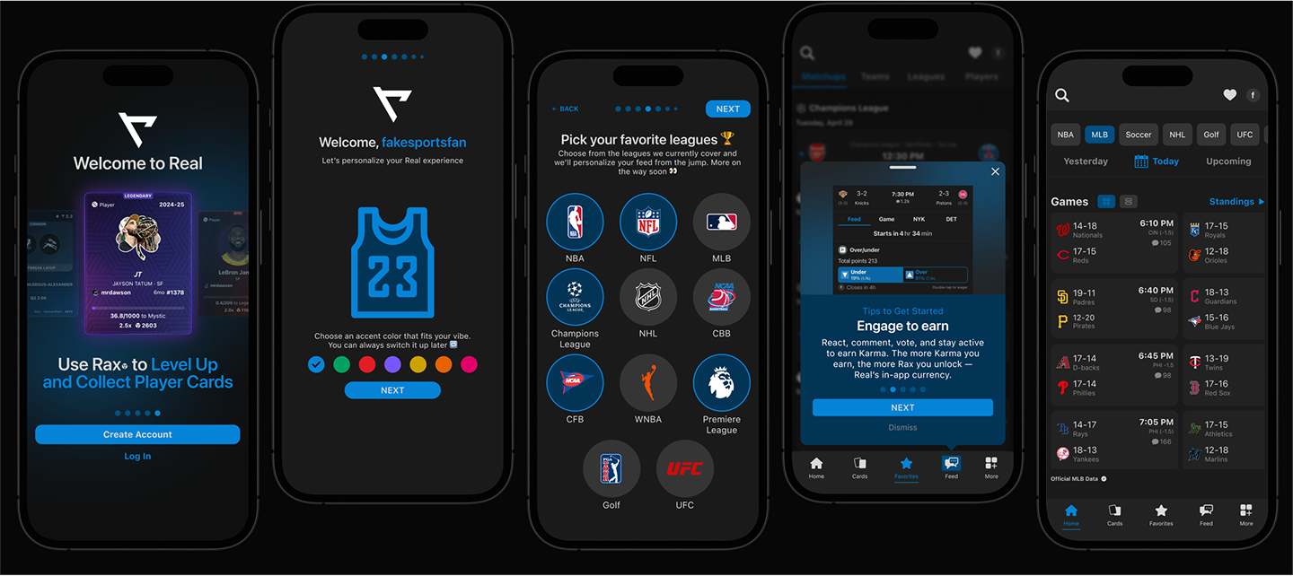
I redesigned it to be a friendlier entry point that introduces the brand and sets expectations early. While still lightweight, it now primes users for what they can do within the app.
The redesigned personalization-driven onboarding flow guides users while building excitement around their favorite teams, leagues, and players which will be used to tailor their experience later.
The onboarding instructions include thoughtful copywriting that fits Real's vision of making sports social and fun.
Introduced a quick, visual tour to highlight Rax, Karma, Cards, and Real’s player performance ratings. Users can now quickly grasp the app's core features and understand how to navigate the interface so that they can engage with what matters most.
The homepage was redesigned to establish stronger visual hierarchy, reduce clutter, and prioritize content that drives engagement — starting with giving users the option to choose their preferred scorecard layout.
Key navigation elements were repositioned. Utility icons were moved to the top and the bottom navigation bar was updated to include text labels, removing icon ambiguity.
The updated bottom navigation bar now directs users to all core features within the app, making it faster and easier for users to find the content the app is centered around.


Users now have quick access to a personalized hub where they can track their favorite teams, players, and leagues — encouraging daily check-ins and making Real feel uniquely theirs.
Reflection
While this was a solo redesign without live deployment, if I had more time or access to Real’s internal team, I’d:
- Run A/B tests on onboarding flows and tour variations
- Run usability tests with different types of users (new, casual, frequent)
- Measure card interaction, Karma/Rax collection trends and player card collection trends pre- and post-redesign
The biggest lesson I learned is how critical navigation hierarchy is when dealing with platforms that are packed with many features. Unique and fun features mean little if users can’t find or understand them.
This project also reminded me how important first impressions are in today’s world, especially the onboarding flow. Most UX problems happen because designers assume users already know how a product works, although it's critical that us as designers are doing everything to ensure user's don't have to guess.
