View
Slack
A Simpler Way to Reply:
Rethinking Slack’s Threads Experience
I led the redesign of Slack’s thread experience to make conversations feel more intuitive, visible, and flexible—reducing friction for quick replies while still supporting deeper, focused discussion when needed.
Context
When Slack launched Threads in 2017, the goal was clear: give fast-moving teams a way to keep conversations focused. It gave people a place to hold side conversations without overwhelming the main channel. This was especially useful in large, fast-moving workspaces where context could quickly get lost.
However, as communication evolved with the emergence of remote and async teams, users expected more fluidity from their tools. With this evolution, slack’s idea of focused conversations quickly started to feel more rigid than fluid. Important replies got buried, casual messages took too much effort, and conversations lost momentum.
The Challenge
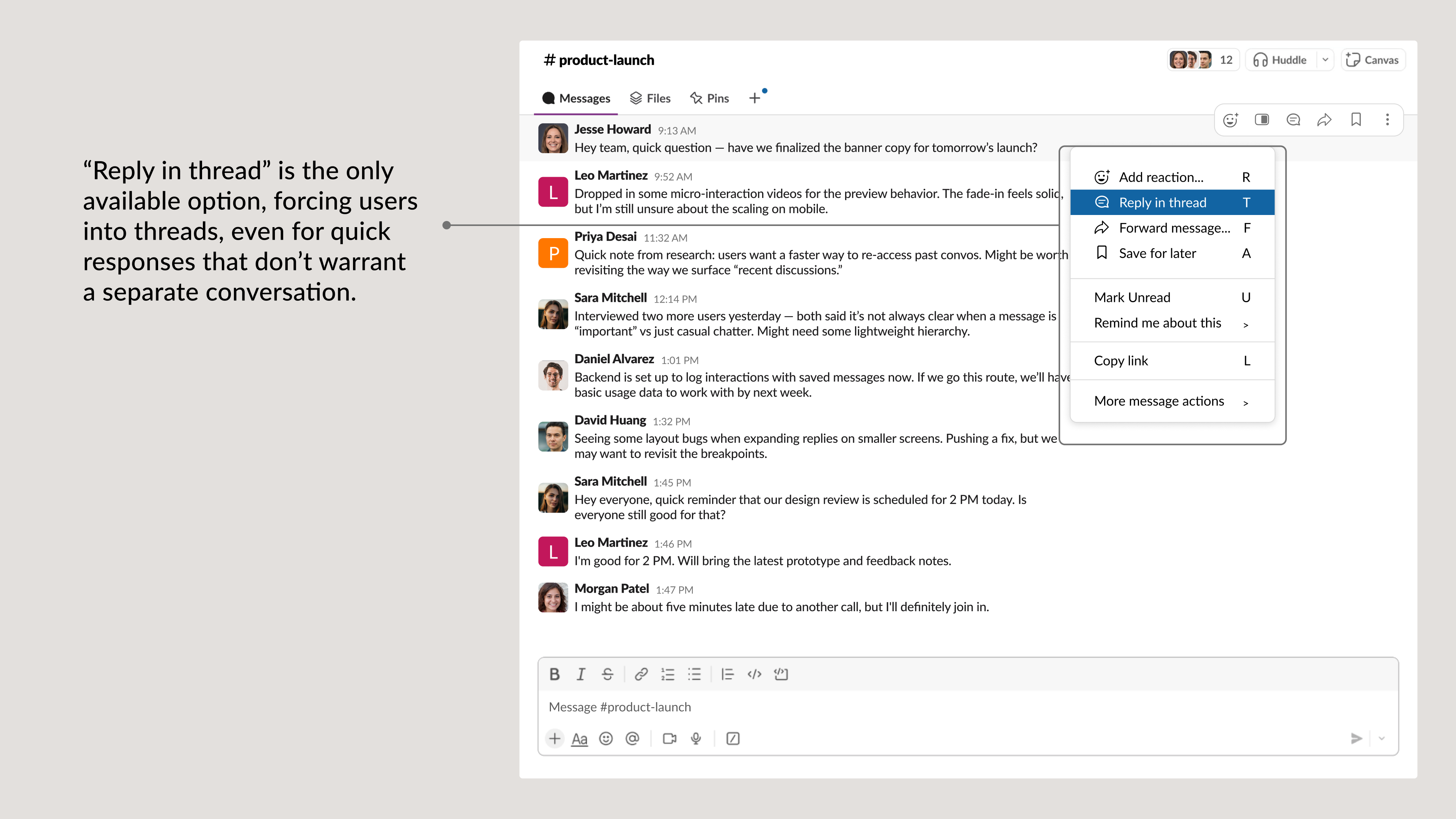
Slack threads were built to organize. But most users? They just want to reply. During early testing, I noticed a recurring hesitation: users paused at the phrase “Reply in thread.” The label felt heavy, as if they were starting something formal when they just wanted to send a quick response.
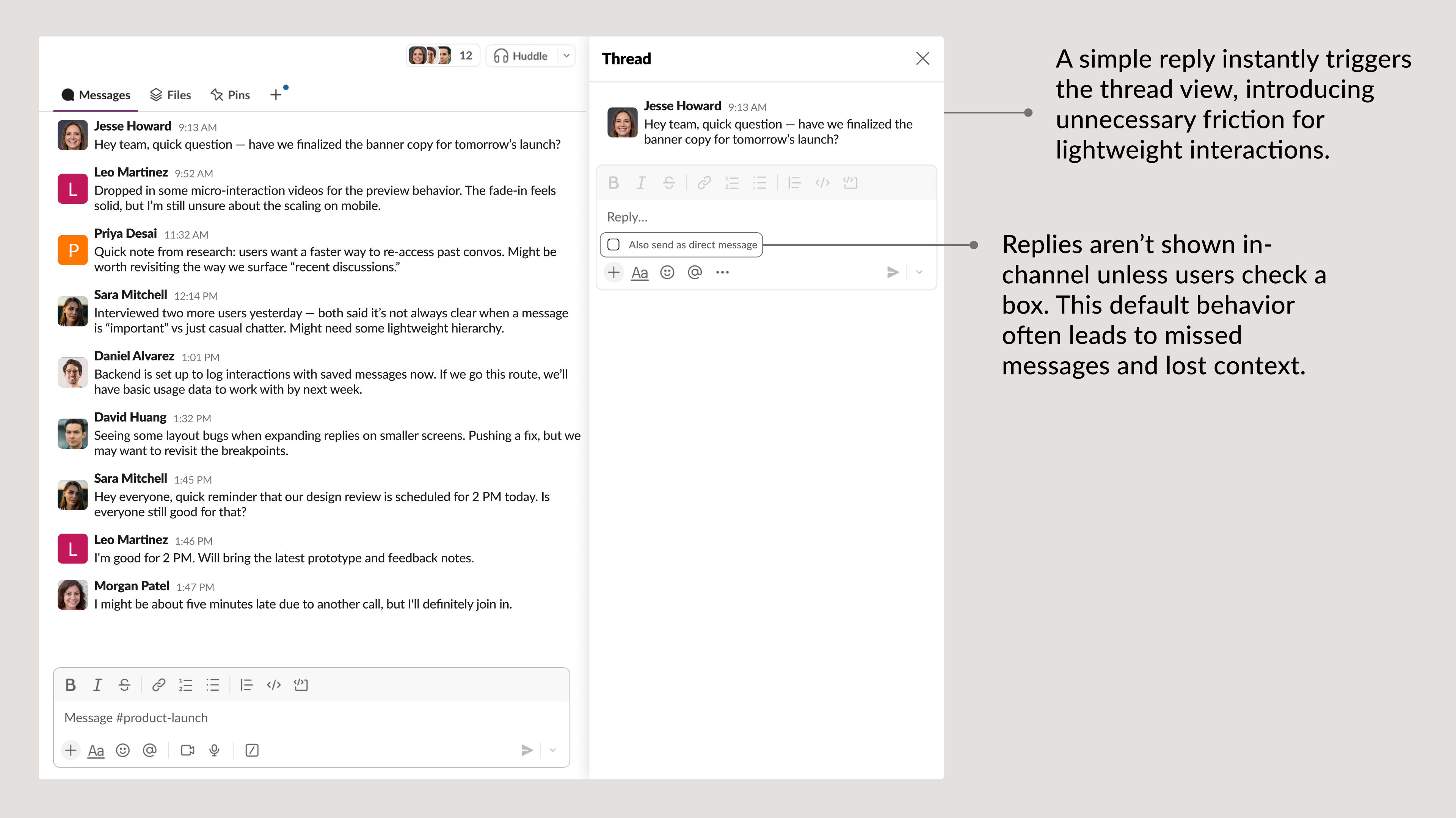
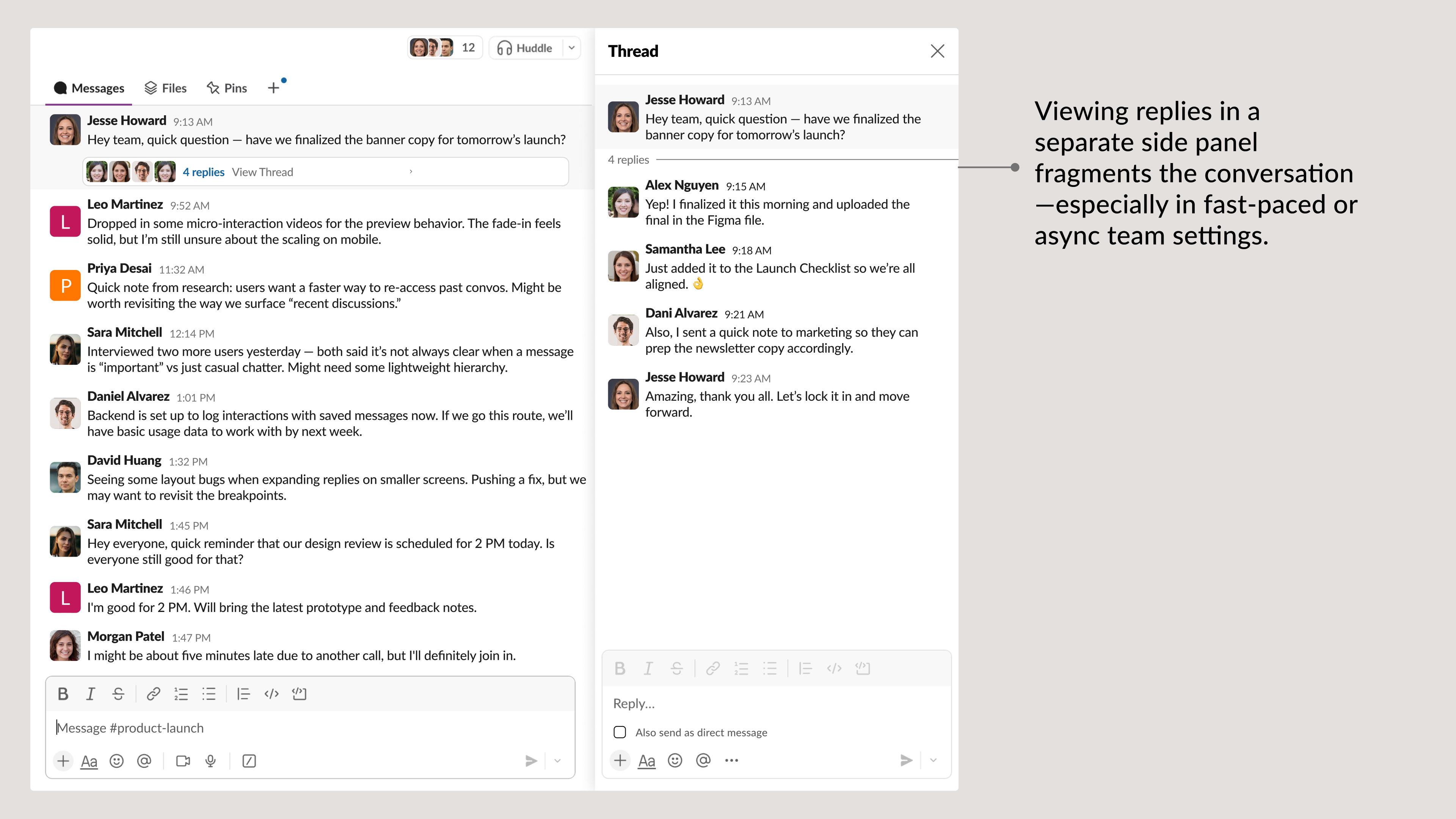
Even when they did reply, the message was sent to a separate view, breaking the flow and forcing context-switching. Conversations felt fragmented, and small but meaningful interactions were getting lost.
In its current form, Slack's reply model introduces friction in two key ways:
- Lack of control: Users could only reply by starting a thread. There was no way to respond inline without disrupting the channel or spawning a new conversation format.
- Loss of context: Once a reply becomes a thread, it disappears from the main conversation. Unless users actively check the thread sidebar, important updates often go unseen.
These patterns pulled attention away from the moment, breaking the rhythm of collaboration and adding unnecessary steps to something that should’ve felt simple. Identifying these patterns raised the question at hand:
Solution
Replying in an async environment should feel as natural as a tap on the shoulder. Users shouldn’t have to second-guess how to respond or where a message went. The goal was to make every reply feel effortless, expected, and in sync with the natural rhythm of real-world communication.
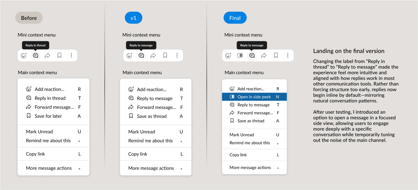
Before, the option to “Reply in thread” implied formality and friction. Reworking the interaction to be “Reply to message”, created a big shift in behavior, despite being a small change. Users no longer felt like they were committing to a new conversation format. It simply felt like... replying.
Not every reply needs to become a thread. But some do.
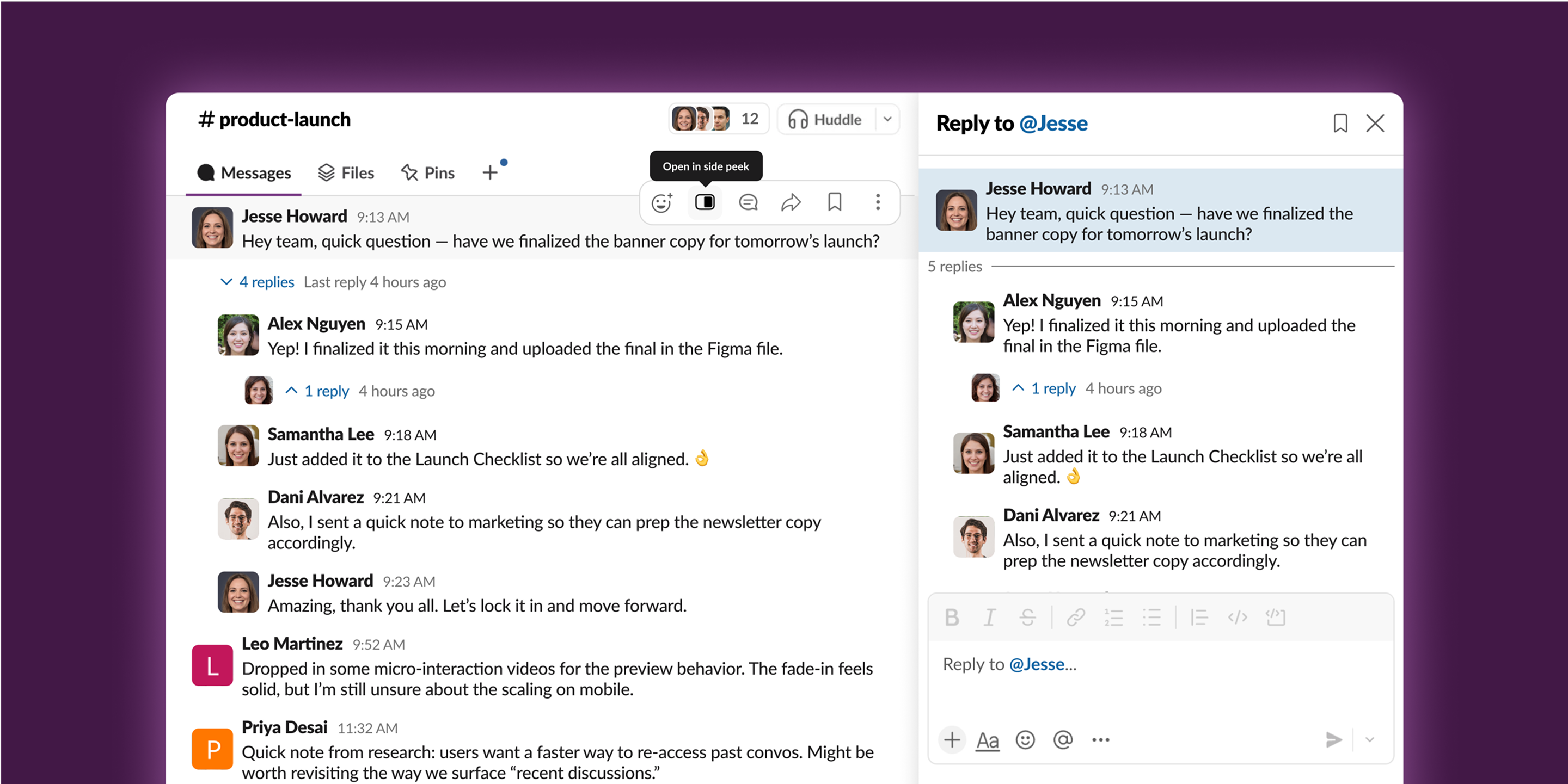
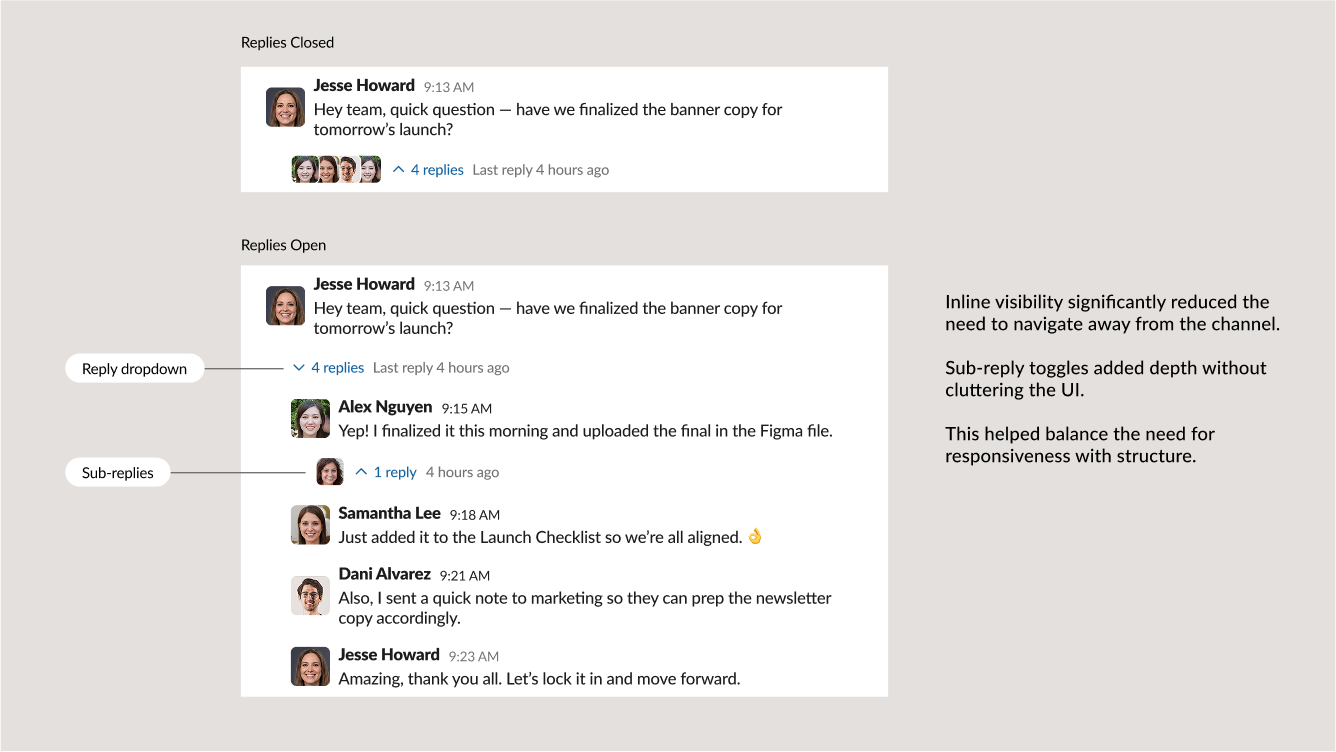
To mirror natural conversation flow, I made replies appear inline by default, directly beneath the original message. This helped users stay in the moment and reduced the cognitive cost of jumping between views.
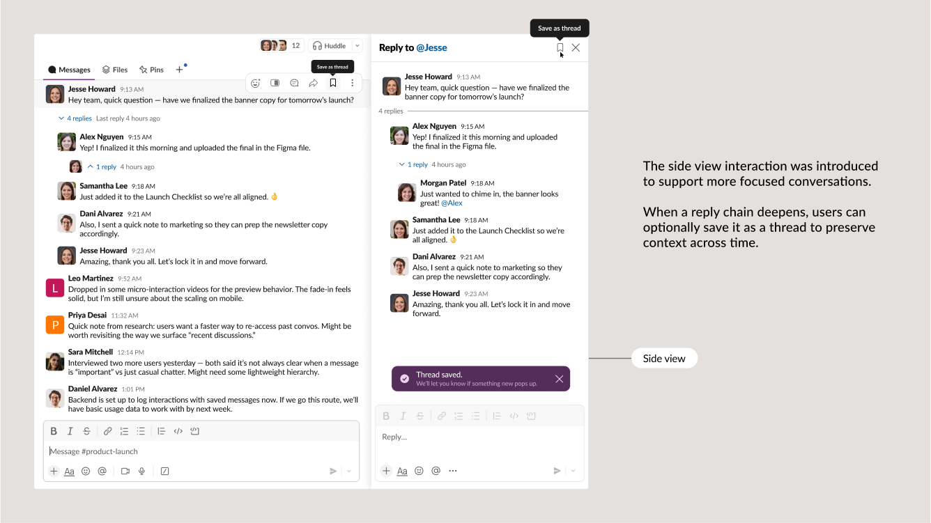
As conversations evolve into more meaningful discussions, I gave users the ability to save any reply chain as a thread, offering the benefits of organization without imposing it from the start.
I introduced a Side Peek view that opens the full message thread without leaving the channel. This gave users a focused canvas to engage deeply. It was perfect for longer discussions or async catch-up. Side Peek helped users dive in without losing their place.
One of the most noticeable painpoints wasn’t starting a reply, but rather remembering that it happened at all. Most users weren’t checking back in on reply chains. Many didn’t even realize someone had responded.
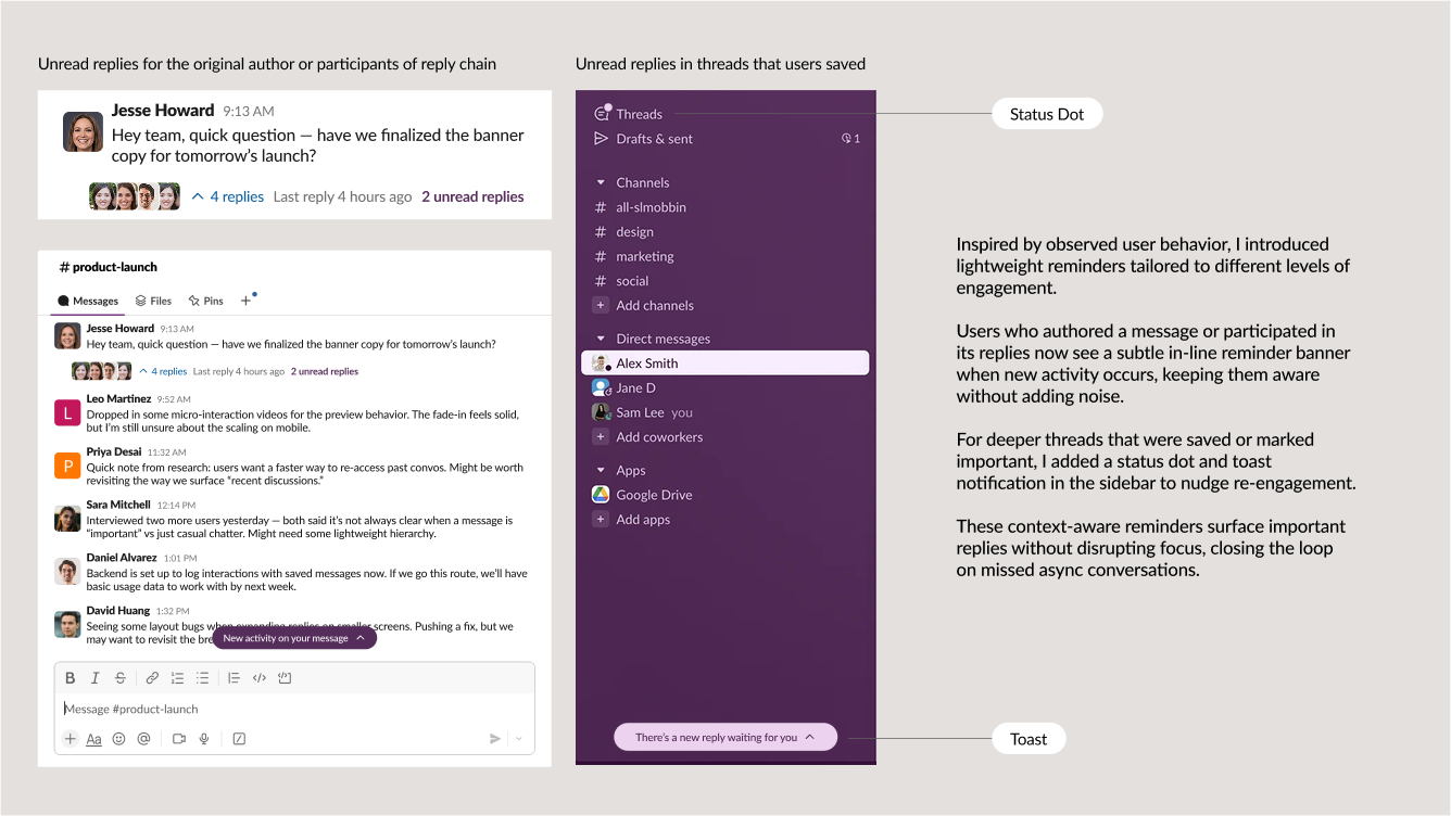
I designed a system of lightweight, context-aware reminders:
- Inline banners to gently surface new activity for authors or participants of a reply chain
- Status dots and toast notifications in the sidebar for saved threads
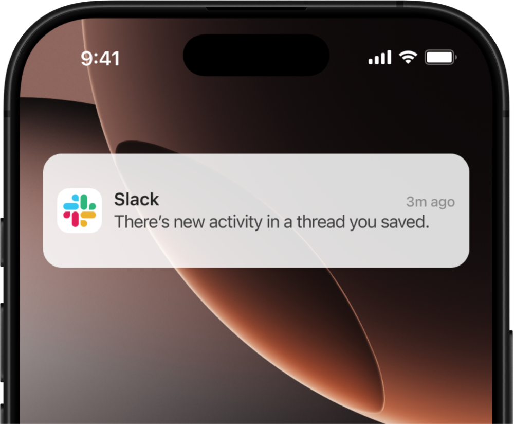
- Mobile notifications and email reminders if replies haven't been seen after a certain time period.
These subtle nudges helped close the loop without disrupting focus, and users could adjust the notifications within their Slack settings for further control.

Understanding the Problem
In Slack, the way replies were handled was adding to the noise, not subtracting it.
Not all replies are created equal. Some responses deserve to branch into meaningful discussions. Others are just a quick thumbs-up, clarification, or update. By giving users the power to choose how they reply, we can reduce friction while preserving Slack's original vision for focused conversation.
Hypotheses
Based on the insight, I focused on 3 areas that would be my design focus: giving users control over how they reply, making replies discoverable in the channel flow, and encouraging re-engagement with important threaded conversations.
If we allow users to reply in channel, then we should see reduced friction and smoother communication flow.
If we keep replies visible in the main channel by default, then we should see fewer missed messages and better real-time awareness.
If we gently surface reminders for unread thread replies in the original channel context, then we should see increased re-engagement with important async conversations.
Iteration Journey
Before landing on the final experience, I explored multiple directions to validate what would make conversations between users feel effortless, and how we could help decrease the amount of replies that goes unnoticed. Each iteration helped clarify a different moment of friction.
The original interaction label "Reply in thread" forced users to turn a simple reply into a external conversation outside of the main channel, disrupting the flow and making replies feel heavier than necessary. I changed the label to "Reply to message" to make replying to a message feel more intuitive and natural, matching patterns found in most modern chat apps and reducing hesitation around lightweight responses.
To give users more control over how they engage, I also introduced a side peek view. This allowed them to open any message in a focused context without losing their place in the main channel—enabling deeper conversations without added friction.
To make replies feel more natural, I experimented with making them inline by default, opening the conversation directly beneath the original message. This better mirrored everyday conversation patterns and aligned with user expectations from other messaging tools.
To maintain the value of threading for deeper or ongoing discussions, I introduced a "Save as Thread" interaction—giving users the ability to store and re-engage with important reply chains when needed.
To ensure users never missed meaningful replies, I explored a series of context-aware reminders tailored to different behaviors. Inline banners alerted users who authored a message or participated in a conversation when new replies came in, subtly nudging engagement without breaking focus.
For threads that users had explicitly saved, I layered in a toast notification and a status dot in the sidebar. These touches kept important conversations visible without adding noise, helping users close the loop on async discussions.
Learnings and Future Steps
As a Slack user myself, I’ve always found it frustrating that every reply has to be a thread. My Threads tab became a graveyard of throwaway comments I never meant to save and I was forced to see a simple reply to someone get overshadowed by a flood of new updates.
That moment of friction made something click: the way we reply shouldn't be dictated by structure, it should be shaped by intention.
- Small language shifts can change behavior.A simple label like “Reply to message” vs “Reply in thread” made the biggest difference in how people engaged.
- People tolerate bad UX more than you think.User testing showed just how normalized the frustration around Threads had become. The new flow felt like a breath of fresh air.
- Restraints sharpen focus.With limited development resources, I had to be intentional about what stayed, what got simplified, and what added real value.
- Don’t overdesign what’s meant to feel human.Replies aren’t product features. They’re conversations. They should feel effortless.
- What if users could organize their saved threads?
- Could the thread sidebar become a more intentional workspace?
- And how might Slack better surface “conversation gravity”?
In the end, this project reminded me that good design should feel invisible. Good design is about removing friction from the small moments that matter most. Sometimes, the biggest impact comes from making the most common interactions feel as smooth as they can be.
