View
St. John’s University
Redesigning a dated university platform into a seamless, student-first hub.
The Campus Activities department of St. John’s University has a platform solely dedicated to providing student organizations the information and resources they need to succeed, however using the platform felt more frustrating than helpful.
I led the redesign of the platform to streamline discovery, simplify access, and create a centralized hub that feels as vibrant and human as the campus itself.

The Problem
At St. John’s University, student leaders are the heartbeat of over 100 campus organizations. While this platform was meant to be a resource of support for student leaders, the support felt fragmented by a lack of clear navigation, making it difficult for student leaders to find essential tools and resources.
Disorganized content, outdated design, and a poor user experience led to frustration, wasted time, and the need to consistently contact university staff with repetitive questions about resources they need to succeed.
This constant back-and-forth slowed down processes and limited the department’s ability to focus on larger student engagement initiatives.
The Approach
To reimagine the experience, I began by meeting with student leaders and Campus Activities staff to uncover the friction beneath the frequent support requests. Through interviews, surveys, and audits of the existing platform, a few key insights emerged:
These insights shaped a strategy focused on clarity, structure, and self-service — not just designing a better interface, but building trust in the platform as a dependable partner for student leaders.
Since the previous platform’s biggest pain point was poor content organization, my first step was coming up with a revised and simplified architecture that focused on a user-friendly browsing experience.
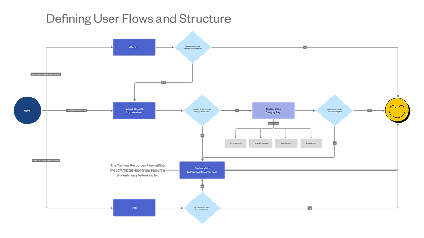
Solution
The reimagined toolkit simplifies how students access resources, replacing buried information with guided structure, making it easier for students to lead with purpose.
Streamlined Resource Hub
Students can browse through every resource available to them all from one location, reducing the overall time they need to spend on the platform.
Chatbot Assistance
A conversational AI chatbot guides students to the right information, reducing staff inquiries while still ensuring support to students who need further help.
Impact
Post-launch surveys showed that student leaders were able to locate essential tools, forms, and guidelines significantly faster—saving time and reducing friction across their organizational responsibilities.
University staff saw a significant drop in student emails requesting platform-hosted information.
Post-launch surveys indicated a 75% increase in user satisfaction regarding resource accessibility.
Reflection
While this wasn’t a traditional SaaS platform or app, the design problems were just as complex: I was tasked with streamlining fragmented information across multiple channels into a single, role-based self-service experience—similar to what you might find in internal enterprise tooling or admin dashboards.
This project underscored the importance of user-centered design in developing internal tools. By focusing on the needs of student leaders and administrative staff, we created a platform that not only streamlined operations but also empowered users to take initiative.
I had a great time collaborating with the St. John’s University staff to bring their vision to life. While we successfully reduced staff time spent assisting student leaders, a larger budget and timeline could have allowed for features like a login system for personalized browsing or a guided, course-like experience.
